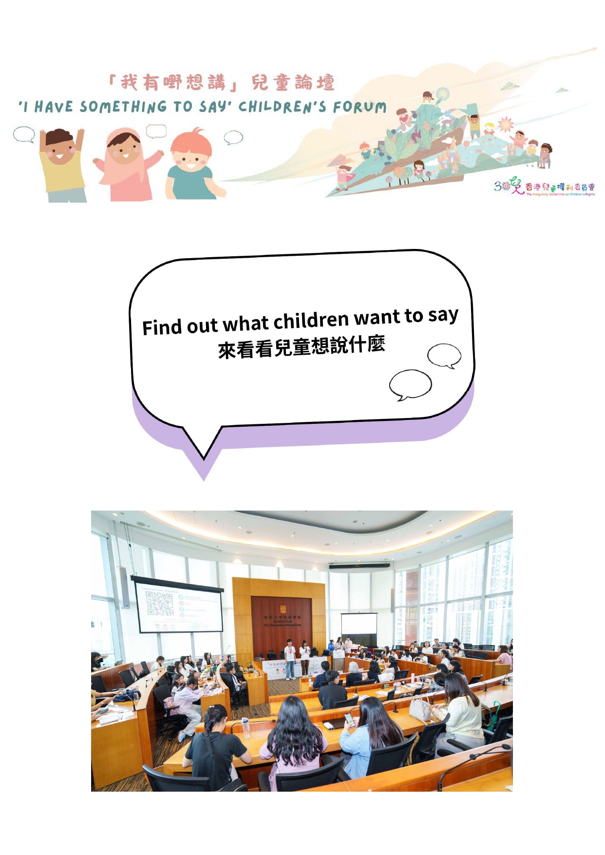
香港兒童權利委員會藉著舉辦「我有嘢想講」兒童論壇聆聽兒童聲音。這份是兒童自己於兒童論壇所準備的稿件。
![]()


Logo

Lavender Pink
stands for warmth and care.

Pale green
stands for growth, freshness, beginning of life and dynamics,
The logo is a composition of two letters of the English alphabet, ‘‘C’’ and ‘‘R’’ ; on abbreviation of "Children's Rights''. It also represents the Chinese character ‘‘兒’’; which means children. These reflect our concern for the children and our objective, which is advocacy and promotion of children's rights in Hong Kong. The shape symbolizes energy and movement , indicating that we are a dynamic organization with a strong mission.
Bearing in mind that children are still growing and vulnerable, they need a warm environment in the care of adults. We, also, believe that children have rights to participation and should have adequate preparation for their lives in the society.
![]()
Logo
Lavender Pink
stands for warmth and care.
Pale green
stands for growth, freshness, beginning of life and dynamics,
The logo is a composition of two letters of the English alphabet, ‘‘C’’ and ‘‘R’’ ; on abbreviation of "Children's Rights''. It also represents the Chinese character ‘‘兒’’; which means children. These reflect our concern for the children and our objective, which is advocacy and promotion of children's rights in Hong Kong. The shape symbolizes energy and movement , indicating that we are a dynamic organization with a strong mission.
Bearing in mind that children are still growing and vulnerable, they need a warm environment in the care of adults. We, also, believe that children have rights to participation and should have adequate preparation for their lives in the society.
「我有嘢想講」兒童論壇–來看看兒童想說什麼